Devlog #11: Accessibility Design
Progress Updates
There’s been a lot of momentum over the past couple of weeks! A lot has had to do with building out the remainder of the control scheme, specifically in the way it differs between playing with a mouse versus a keyboard alone. In part, the possibility of keyboard-only play was important to me for the way it would translate to gamepad play, but more importantly, it’s been a central part of the main work I’ve been doing over the last week or so, which is accessibility design.
Accessibility Design in Progress
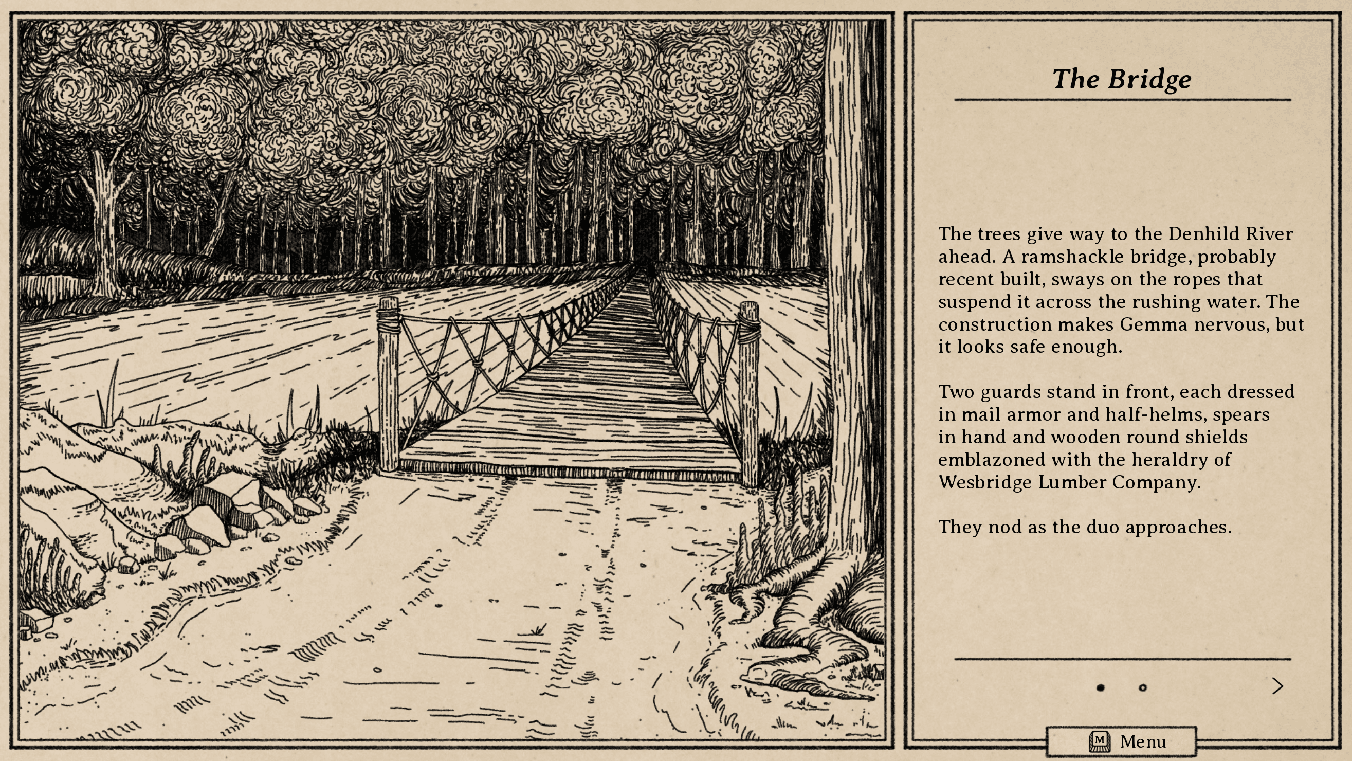
South of the March is structured as a visual novel in dialogue and exploration segments, with a JRPG-style turn-based battle system for combat. While that does mean it’s significantly more visual my previous games (The Salt Keep, for example), it still relies heavily on text and should be possible to fully experience even without visuals.

A few factors to make this work are already largely in place:
- Keyboard-first design that avoids things like mouse hovers makes it possible to play entirely with the keyboard, not as a work-around, but as the intentional layout.
- Accessibility settings offer readability adjustments, such as high-contrast text, text size adjustments, and opendyslexic font.
- Combat is passively turn-based, meaning that its focus is on strategy and party planning, rather than timing or reflex-based challenges.
- Difficulty options allow for adjusting combat to a “just the story” level of challenge for those who are here only for narrative.
- While a happy accident more than an intentional feature, the monochromatic design eliminates color-blindness concerns

Self-Voiced Narration and Dialogue
While that gets us a lot of the way there, the big step I’ve most recently been working through is self-voicing. South of the March is built in Ren’Py, which supports self-voicing by default (allowing default system screen readers to voice what’s on screen). However, almost everything outside of dialogue veers from the Ren’Py standards, and the version of Ren’Py I’m using has been fairly heavily modified to get everything working.
As a result, I wasn’t sure at first if the default self-voicing would still function. With a bit of modification, it currently handles some things cleanly: reading out descriptions of the setting and action and playing out dialogue in real time are no problem, and function pretty intuitively. Combat and menus, on the other hand, need some finessing. By default, it wants to just read everything on screen in order, which for a menu full of options and descriptions and stats, is wildly impractical.
The Work So Far
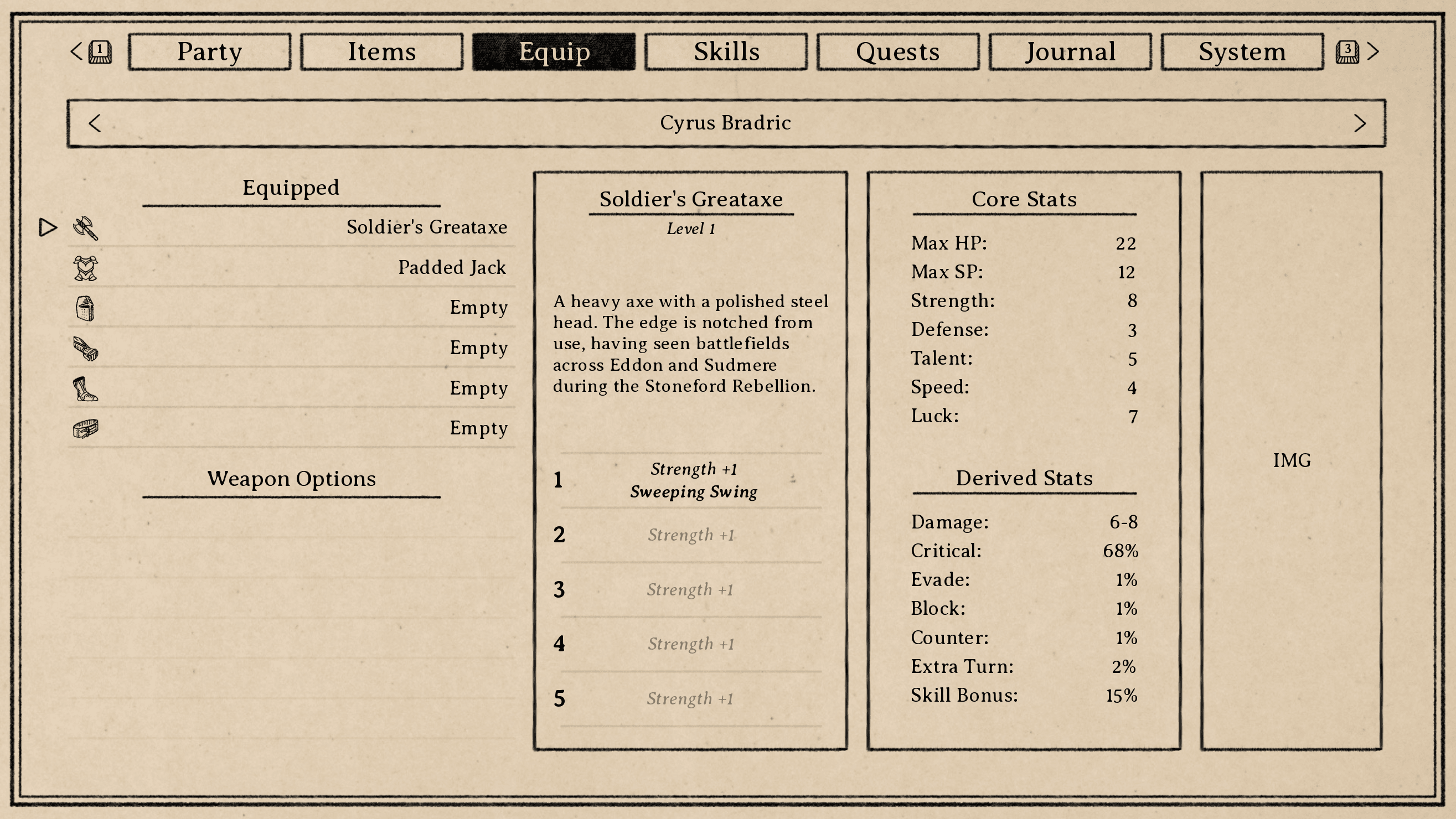
Designing the back end of these screens for self-voicing is where I am now. For example, take this (unfinished) equipment screen:

When you enter this screen, your cursor focus will initially be on the “Equipment” section on the left. You can move the cursor up and down with the arrow keys, and each slot type and item name will be read aloud. The way I’ve currently set it up is to allow another key press (space bar, right now) to toggle through additional info for each item, which are listed in the boxes to the right: the item level, then the upgrade tiers, then item description, then the core stats and derived stats, one at a time. Hopefully this will avoid re-reading redundant text, and will front-load the most relevant information that would be checked and rechecked most often.
Similar screens work similarly, and while I haven’t made spent too much time with combat yet, I expect it’ll function about the same way: high-level arrow key navigation with secondary options for deeper info. That said, this is kind of guesswork for me right now. I’m not an accessibility expert, and needing a screen reader to play a game is not an experience I have. I can try to put myself in those shoes and imagine what information I would want in what order, but without the lived experience, it’s hard to really appreciate what will be tedious, or what repetition would be unconsciously filtered out by being used to the format, and so on like that.
Nagging Questions
Some of the biggest questions I’ve been left with so far in this process are actually some of the most basic. For example:
- How does one learn the basic controls initially? Maybe most people can assume using arrow keys to navigate and "enter" to select, but beyond that, it all seems to vary wildly. As an example, Ren’Py allows users to turn self-voicing on with the “v” key by default. How does a player unfamiliar with Ren’Py, or not aware that a game is built in Ren'Py, know that? External documentation?
- On the same note, how should I communicate more specific controls and controls that vary by screen? For example, on the equipment page shown before, the left and right arrow keys can be used to toggle between characters. I can imagine a scenario where one tabs between these buttons (similar to the way it might work on a web interface) and their function is read out. However, that feels unnecessarily repetitive when the arrow keys can already be used to directly make those selections, so perhaps it makes sense to just read out available controls when you first enter the screen, which self-voicing players can skip/ignore once they're used to it.
- I could also imagine a scenario where there's a dedicated button (the "?" key, or something) that can clarify available controls on any given screen if you're using it for the first time, or if you forget. That seems reasonable to me, but doesn't address how a player would know about it in the first place.
I suspect a lot of these questions are fairly obvious and somebody reading is saying "just do [x], you huge idiot," but it's been surprisingly difficult to find best practices for this kind of design. There are a lot of resources for web development, which worked well for accessibility in my fully text-based previous games, but for games with significantly more moving parts, I haven't found much.
Next Steps
My plan going forward is to finish this first pass at a fully self-voiced version based largely on educated guesses, then offer it up to experienced players (at the AudioGames.net forums, perhaps others as well) for feedback. Given the genre, the overall design, and the text-heavy narrative focus, I think it should be possible to make it a smooth experience even with no visuals at all.
In short: yeah, this'll work somehow.
South of the March
Adventure and horror in a hand-drawn fantasy RPG
| Status | In development |
| Author | Small Gray Games |
| Genre | Role Playing, Adventure, Visual Novel |
| Tags | Dark, Fantasy, Hand-drawn, Horror, Medieval, Story Rich, Text based, Turn-Based Combat |
| Languages | English |
| Accessibility | Color-blind friendly, Subtitles |
More posts
- Devlog #20: Combat Speed & Status Effects46 days ago
- Devlog #19: Designing New Map NodesSep 02, 2025
- Devlog #18: Projects on ProjectsAug 16, 2025
- Devlog #17: Post-Holiday UpdatesJan 04, 2025
- Devlog #16: Demo Work & Video PreviewDec 10, 2024
- Devlog #15: Demo Plans & Additional PlatformsNov 18, 2024
- Devlog #14: Sidequest DesignOct 25, 2024
- Devlog #13: Tutorials & Status EffectsOct 07, 2024
- Devlog #12: New Animations & Accessibility UpdatesSep 17, 2024

Leave a comment
Log in with itch.io to leave a comment.