Devlog #10: Redesigning Combat UI
Progress Updates
As discussed in the last devlog, we're getting back up to speed a bit, but still making some solid progress. For example:
- Start Menu functionality and splash screen in place
- More settings hooked up
- End Credits functional
- Multiple sidequests in development
- The start of gameplay tutorials
One thing in particular I wanted to go into a bit more detail on is the process of redesigning the combat UI.
Combat UI Redesign
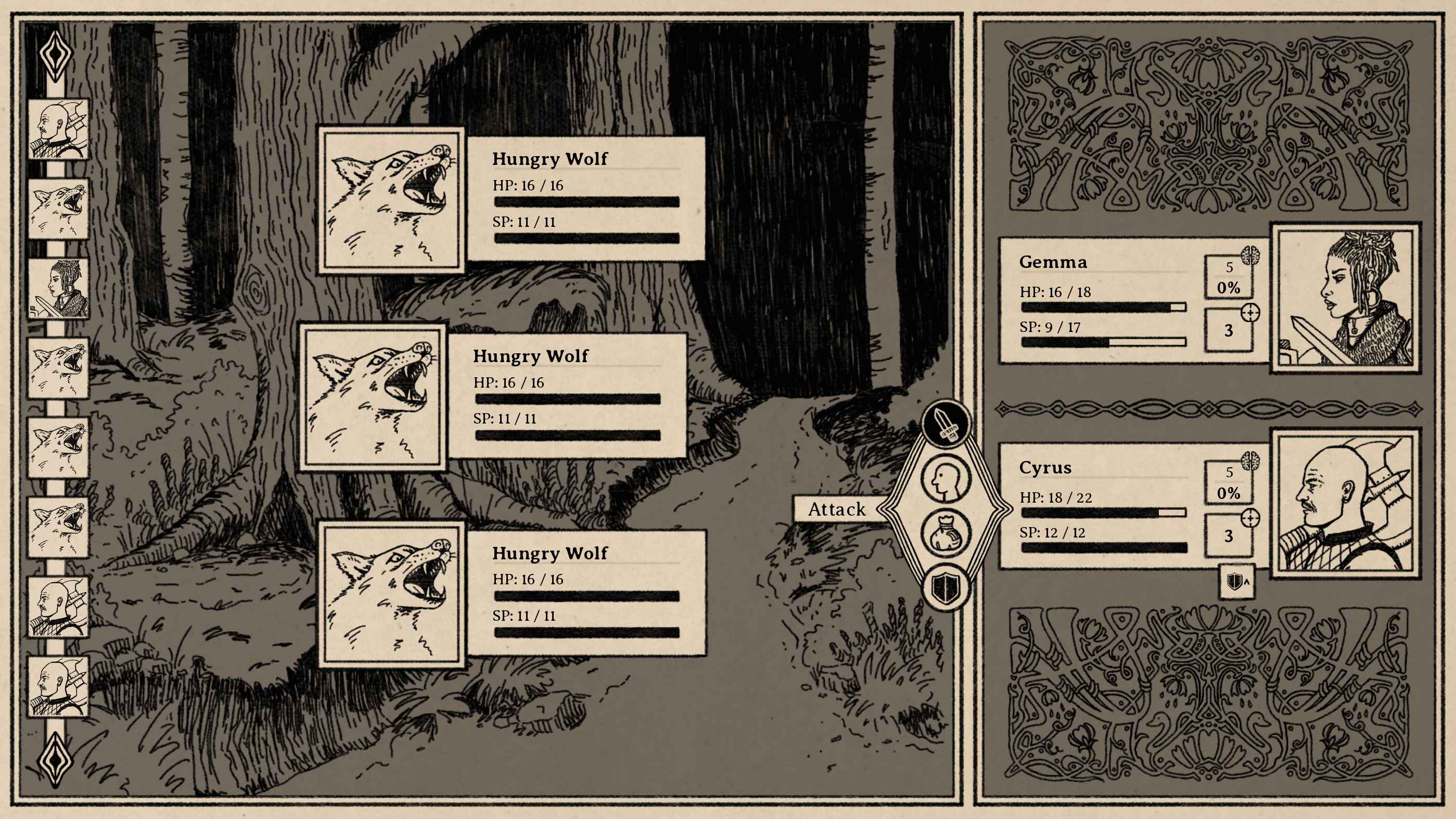
The original design of the combat screen, specifically the player and enemy cards, looks like this:

It's stayed that way for a good while, and I've been fairly happy with it. As we moved deeper into development, though, we started to run into some problems with it. They felt like small problems at first, but I've found it interesting to see the way they snowballed into larger problems the longer they went unaddressed.
Problem #1: Trouble at the Border
First was the separation between the illustration and the battle stats (HP, SP, etc). I originally liked the way the image sat in the background without a clear border between the two elements, but as the number of enemy illustrations increased, we realized a limitation: the images couldn't touch the border on the right side. If they did, you'd see a hard cut-off seemingly in thin air. It may sound like a minor problem, but as we tried to come up with solutions, nothing seemed to work.
Placing a border between the illustration and the battle stats seemed simple enough and solved the illustration problem, but every variation I tried looked kind of strange and arbitrary, out of place. We also considered just maintaining a best practice rule for enemy illustrations that they don't bump up against the right side, but that felt like a huge limitation both in terms of creative options and the practical ability to imply scale by having something span beyond the edges of its UI container.
Problem #2: The Scale Problem
Speaking of "implied scale," that consideration brought us to our next problem. Since the start of development, I'd hoped to have larger illustrations for certain enemies, some because of narrative importance (a human boss, for example), and others because of literal physical size. However, we were well into development before we actually started to think about how to implement it. Obviously we should have planned for it from the start, and it was always in the back of my mind with the original design, but generally got pushed aside as a kind of "we'll cross that bridge when we come to it" problem. Unfortunately, you eventually come to most bridges.
Because the illustration sits inside a single UI frame with the battle stats, increasing the size of the illustration required increasing the size of the frame as well. That wouldn't be a problem in and of itself, but it left the battle stats with big empty spaces above and below. We tried various solutions, like moving the battle stats up and down, filling in designs around them, expanding them, and adding additional information to try to balance it out, but nothing looked right. The larger frames looked clunky and bloated.
Problem #3: Cause and Status Effects
One of the solutions I briefly considered for the previous problem was expanding the "status effects" row so it would eat up more of the negative space. That mostly just looked stupid, but it also forced me to grapple with yet another problem in the initial design, which was that there wasn't actually all that much room for status effects. There won't be a cap on how many a single player or enemy can incur, so no matter what the design, there's always going to be some kind of edge case where the UI can't display them all at once. Regardless, the more I could display before having to do some cumbersome machination to show them all, the better.
The New Design
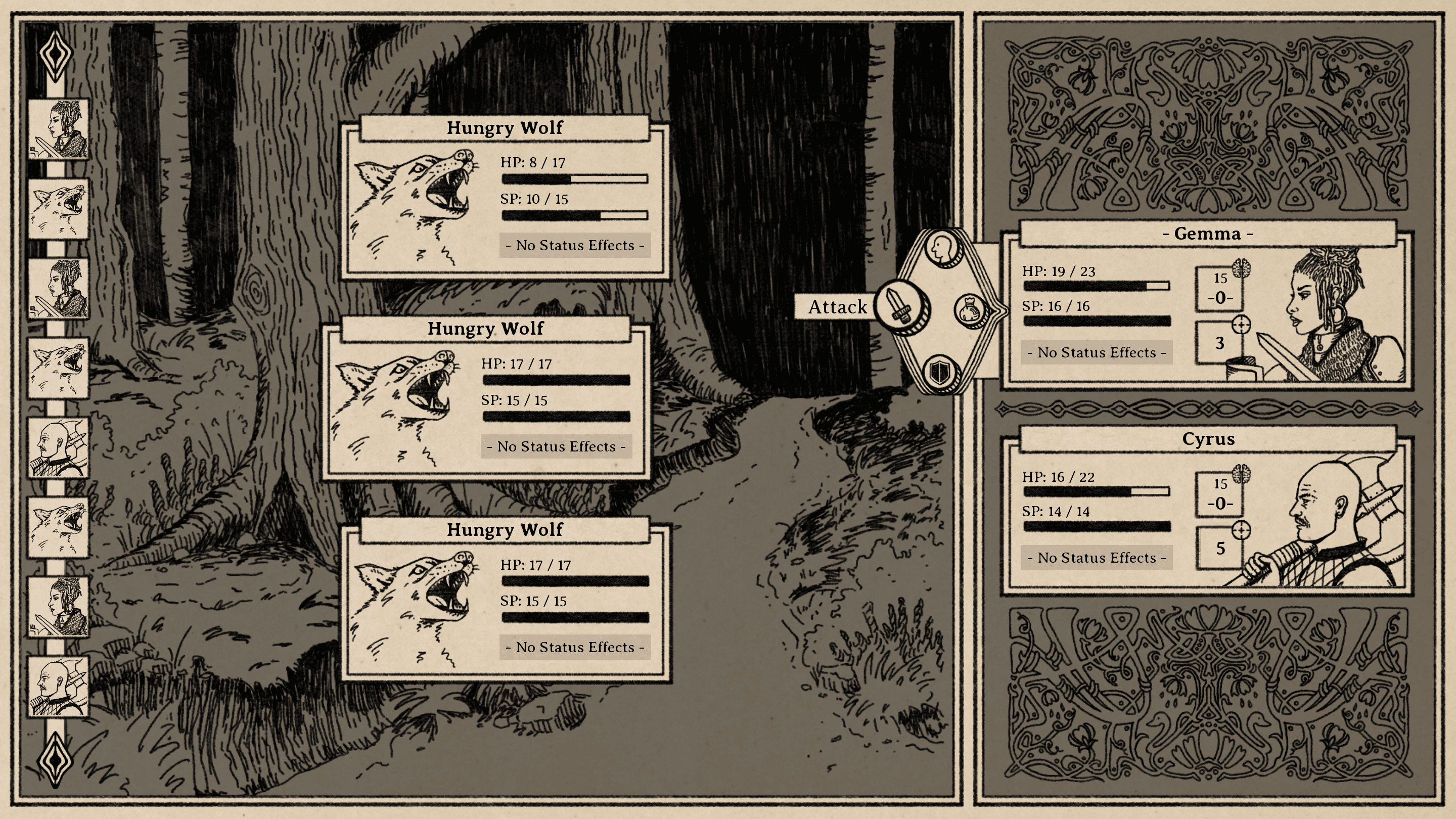
After running into these three problems of varying severity and feeling them grow and compound on each other, I tried out some new designs. Finally, I settled on what I think of as the "key" design because of its key-like shape:

This design solves all three problems at once:
- The illustration has a border on all four sides, so there's no creative limitation on where it can cut off
- The battle stats have their own separate frame, so they can remain unchanged even when the illustration expands
- Status effects are set outside the frame, so significantly more can be displayed at once
At first glance, the designs may not look shockingly different to you, but it was a surprisingly challenging series of dilemmas with a lot of different attempts and movements before we arrived at this conclusion. I wouldn't have expected how much the seemingly small problems would balloon over time, and the ways they would inform each other. Design is hard, okay?
Luckily, I can now take comfort in the knowledge that nothing else in the design will ever have to change in any way again.
South of the March
Adventure and horror in a hand-drawn fantasy RPG
| Status | In development |
| Author | Small Gray Games |
| Genre | Role Playing, Adventure, Visual Novel |
| Tags | Dark, Fantasy, Hand-drawn, Horror, Medieval, Story Rich, Text based, Turn-Based Combat |
| Languages | English |
| Accessibility | Color-blind friendly, Subtitles |
More posts
- Devlog #20: Combat Speed & Status Effects50 days ago
- Devlog #19: Designing New Map NodesSep 02, 2025
- Devlog #18: Projects on ProjectsAug 16, 2025
- Devlog #17: Post-Holiday UpdatesJan 04, 2025
- Devlog #16: Demo Work & Video PreviewDec 10, 2024
- Devlog #15: Demo Plans & Additional PlatformsNov 18, 2024
- Devlog #14: Sidequest DesignOct 25, 2024
- Devlog #13: Tutorials & Status EffectsOct 07, 2024
- Devlog #12: New Animations & Accessibility UpdatesSep 17, 2024
- Devlog #11: Accessibility DesignAug 27, 2024

Comments
Log in with itch.io to leave a comment.
I like the update in the battle card designs. It's an elegant solution to the problems you were encountering. Looks good!
Appreciate it!