Devlog #8: Combat UI, Icons, and Accessibility
Progress Updates
We've been dipping into different things all over the place the last couple of weeks, making a lot of progress in various directions. Big moves recently include:
- Second narrative draft largely completed
- Combat button UI revamped to be mouse-friendly
- Creating icons for various game functions, particularly for item categories
- Early testing for screen-reader accessibility
Combat UI Revamp
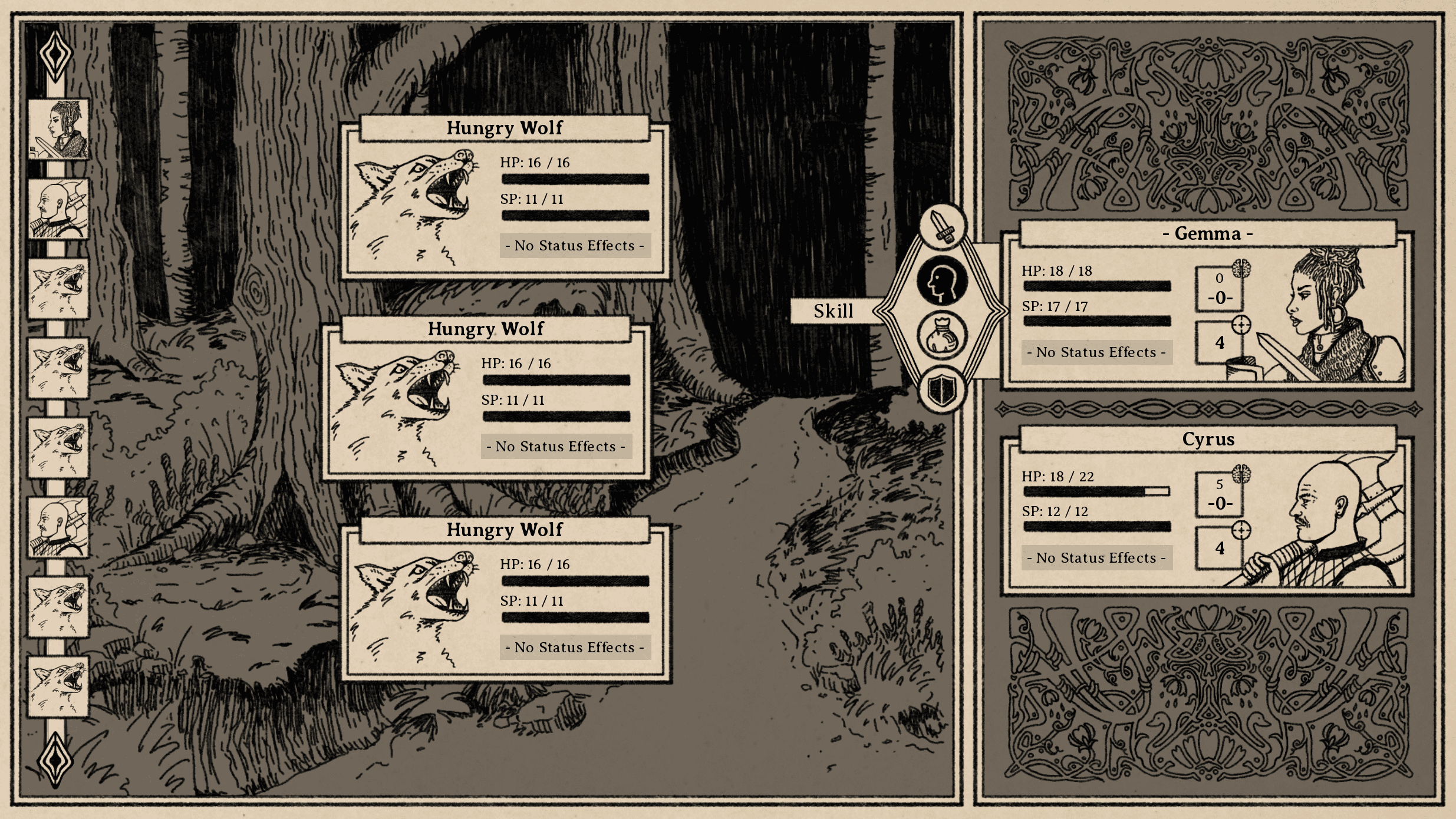
One thing we're currently playing with (and probably going to proceed with) is a change to the UI for the combat options. I had originally conceived of the buttons as a kind of "combat wheel," which I've always enjoyed visually and found satisfying as somebody who primarily plays with gamepads. I was very happy with the look, but in action, I ran into two issues:
- There really was no fully intuitive way to interact with it using the mouse
- Me and the artist had instant and opposite interpretations of which way a direction press would spin the wheel.
There are ways around these problems, but the sort of immediacy of issues with the design led me to think we should maybe try some alternatives, so right now we're playing with a more standard vertical layout, which should be intuitive and 100% mouse-friendly:

Icons Aplenty
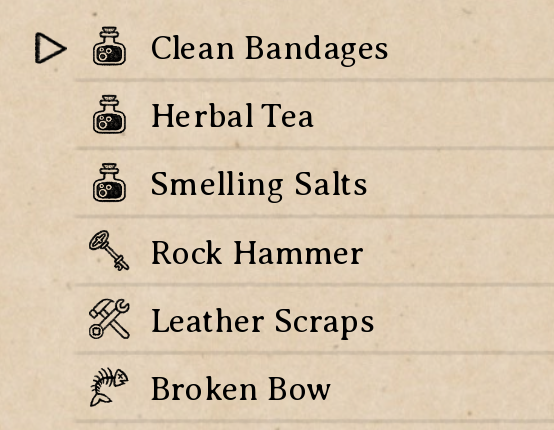
No RPG is complete without a whole bunch of icons! This is an exciting development for me, because one of my major pet peeves in RPGs is when I get an item and don't understand even broadly what type of item it is, then have to go digging through my inventory to see it, which I can't effectively do because I don't know where to look. I very much appreciate getting a quick cue to tell me broadly what something is, instead of just going "you picked up a fauchard" and then laughing at me while I scroll through food items trying to find it.
To that end, we've been working on icons for general item types, as well as the sub-type of equipment slots:

Screen-Reader Accessibility
I've had a number of questions on here and elsewhere about screen-reader accessibility, and while I don't really want to give a 100% promise until I've actually built most of it, it's looking very likely that I'll be able to make this game blind and low-vision accessible.
I'm building it in Ren'py, which does include self-voicing out of the box, but I've had to do heavy customization to include a lot of the features. As it is, most of the default self-voicing is either broken or kind of incoherent, and I was uncertain whether I was going to be able to work around that. After some research and testing over the last few days, though, I've found some options that look like they're going to let me customize enough to get it working. From tests so far, it looks like it should work.
That said, there are still some big design questions there that I don't currently know how to answer. How to handle things like turn-based combat and wall-of-text menus, where there are various visual cues all over the screen that may all change at once sometimes, is going to take some research to figure out. If anybody reading has played games that handle that well via screen-reader of self-voicing, I'd love to hear some suggestions.
Next Steps
I'm noticing a trend in my "next steps" update, which is that it's always "more art" and "add sound." Well, that's still the next steps. The art's chugging along, and sound is actually starting to take shape, though there's nothing worth showing there yet. More coming soon!
Thanks for reading!
South of the March
Adventure and horror in a hand-drawn fantasy RPG
| Status | In development |
| Author | Small Gray Games |
| Genre | Role Playing, Adventure, Visual Novel |
| Tags | Dark, Fantasy, Hand-drawn, Horror, Medieval, Story Rich, Text based, Turn-Based Combat |
| Languages | English |
| Accessibility | Color-blind friendly, Subtitles |
More posts
- Devlog #20: Combat Speed & Status Effects47 days ago
- Devlog #19: Designing New Map NodesSep 02, 2025
- Devlog #18: Projects on ProjectsAug 16, 2025
- Devlog #17: Post-Holiday UpdatesJan 04, 2025
- Devlog #16: Demo Work & Video PreviewDec 10, 2024
- Devlog #15: Demo Plans & Additional PlatformsNov 18, 2024
- Devlog #14: Sidequest DesignOct 25, 2024
- Devlog #13: Tutorials & Status EffectsOct 07, 2024
- Devlog #12: New Animations & Accessibility UpdatesSep 17, 2024
- Devlog #11: Accessibility DesignAug 27, 2024

Comments
Log in with itch.io to leave a comment.
Audiogames.net is a really good gaming community with a lot of visually-impaired players who are often willing to give great feedback on accessibility in games. You might find it to be a wonderful resource as you work through these UI issues.
Somebody mentioned that one on the main page, too. Sounds very promising. Once I get a basic version built out, I'll definitely post there and see if anybody's interested in giving more specific feedback on it.
Kudos on considering the accessibility early on, and as a keyboard/mouse user, I thank you for the mouse-friendly UI. :P Also OMGYES, informative item icons thank you. Not having those is just an annoyance that keeps on giving, in any game.
Appreciate it! I've had an unexpected amount of feedback from blind players on both of my previous games, so it's definitely something I've been thinking about from the start. I was a little worried, because those were both based on web tech (so pretty accessible by default), but this is looking promising.
And yeah, it's such a small thing, but I can't count how many times I've complained about lack of icons. I need concise categorization!