Devlog #19: Designing New Map Nodes
Progress Updates
Other than general progress on art, sound, and the overall structure of the game, the main thing I've been working on recently is a new kind of node for the map. It's meant to solve a problem we've gone back and forth on pretty much since the initial conception of the game, eventually landed one way on, and have been rethinking a bit over the last few months.
The Original Plan
Originally, every node on the map led to a new screen, meaning a fade-to-black load to a discrete "scene" that would include its own navigation. Within that navigation, you can do stuff: look at things in the area, talk to people, do battle, or whatever else, most of which is handled through text. Here's a scene:
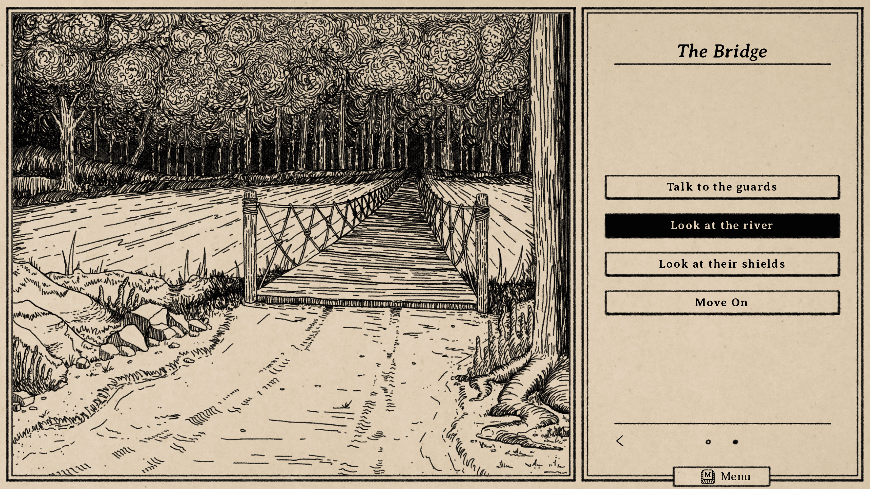
An issue we've been running into, however, is a sort of conflict between the game design and the art as planned; to capture a sense of scale, we want lots of areas, the ability to sort of wander, but with the setup we had been working on, that would've led to a lot of redundant, repetitive art. We don't need distinct illustrations of "the road," and then "more of the road," and then "even more of the road," after all. It wouldn't be particularly interesting, plus it would inflate the workload.
We had actually considered this issue early on and had the idea to include kind of generic, repeating illustrations to fill in these sorts of interstitial areas, but as we started actually writing it out and filling in art, that idea started to feel clunky and weird. We scrapped it, deciding instead to just have fewer overall nodes and let each one be important in its own right.
That worked fine, and it's how we've been building this until recently, but more and more it started to feel limiting. There'd be a small idea I might want to incorporate while writing, but then I'd avoid it because I knew it'd necessitate either a bunch of generic art, or hyper-specific art that just wasn't worth the amount of gameplay or world-building it would have added. It created a very all-or-nothing dynamic.
The New Nodes on the Map
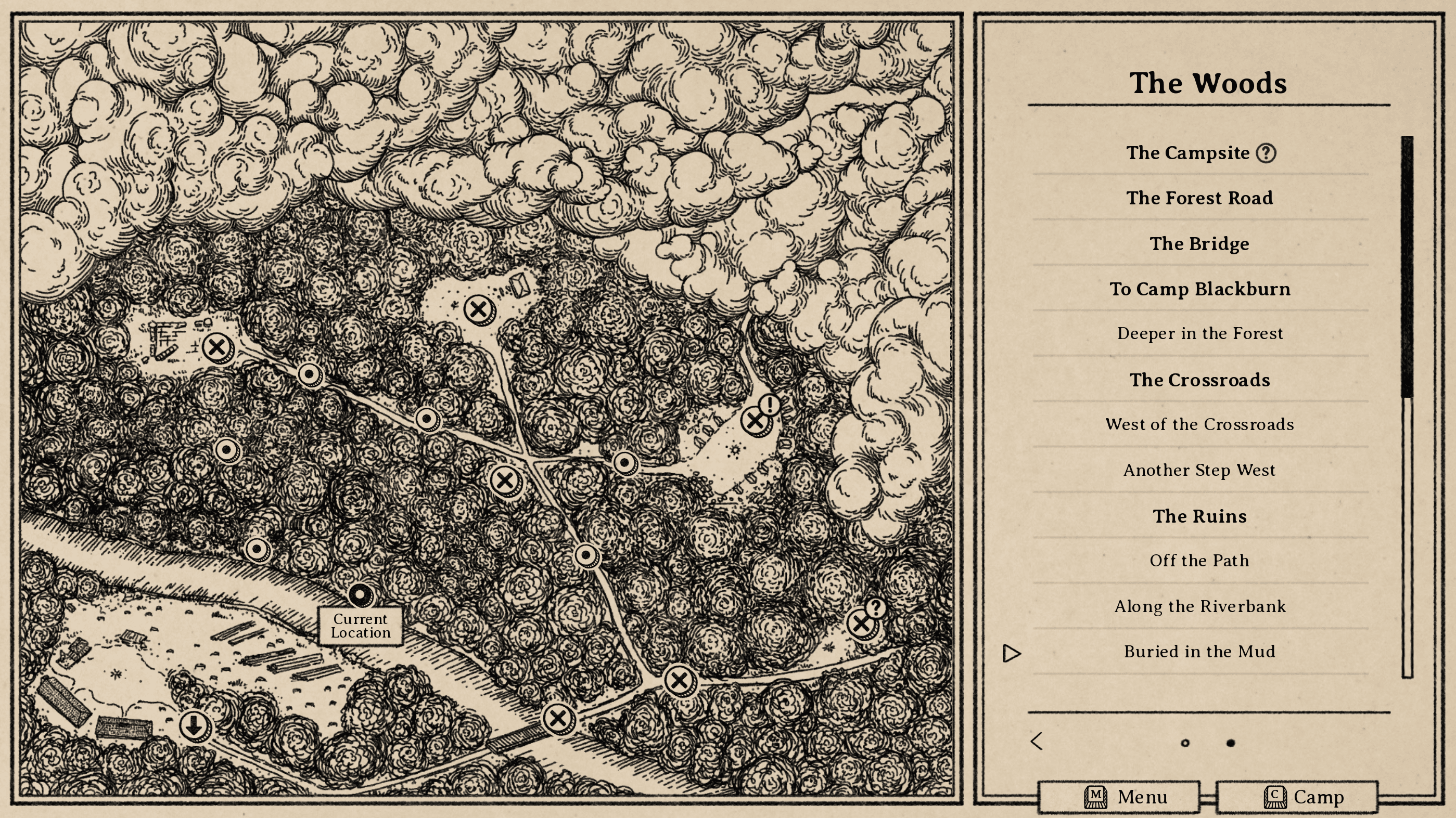
Our newest addition is a solution to this problem: text areas. These are new nodes on the map, represented with a slightly different icon and UI in the name. The original nodes have X icons on the map and bold text in the navigation, while the new nodes show a dot icon and a lighter weight of text. Rather than fading to a new scene, these new nodes open a text popover on the map screen similar to the way "exploration" options do within scenes. It looks something like this on the map itself:
And when loading the new node, it looks like this:
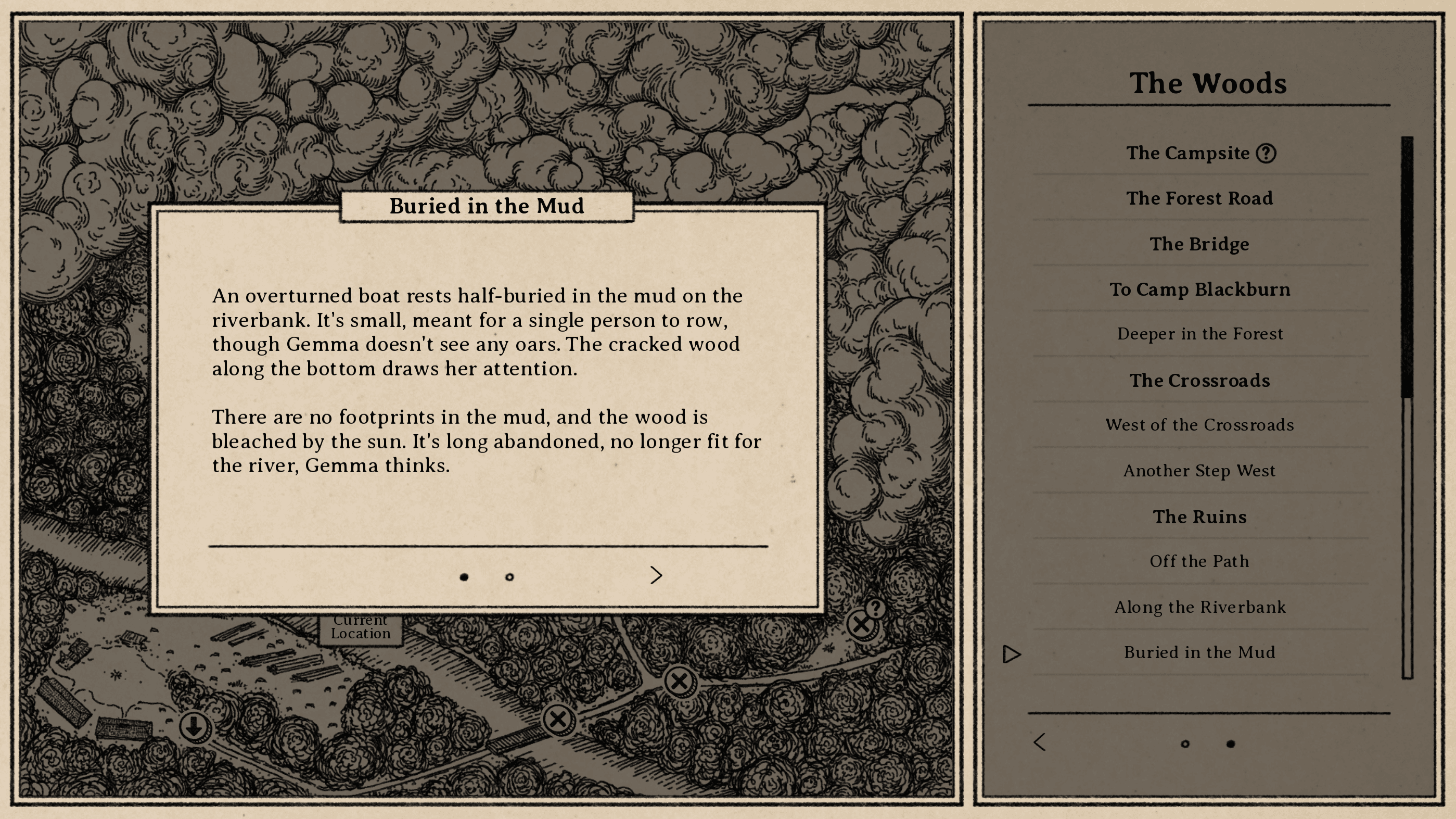
These nodes will take on two different forms, both of which look and function similarly.
- Some will be nothing but text. These will mostly be used for either world-building, or narrative pacing. They allow for small story beats to happen outside of "scenes" and lead up to them, and to throw in smaller details that don't warrant a full illustration.
- Others will be text with a choice. They'll be simple and straight-forward, functionally a "yes" or "no" every time, but with a payoff you won't know until you choose. You may find a helpful item, or you may be walking into danger.
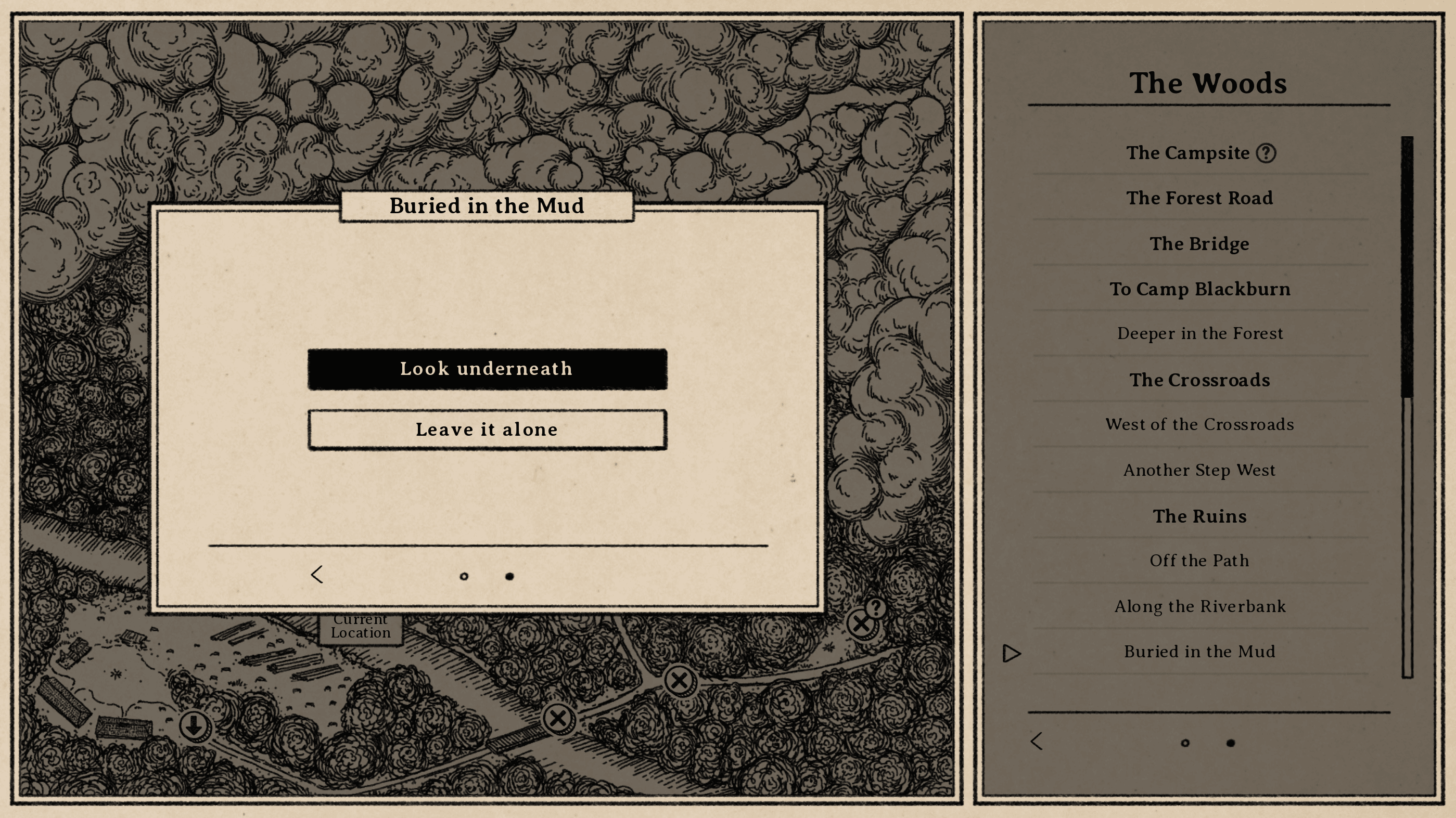
With these new types of nodes, it's not only possible to be quite a bit more flexible, but we're also able to add significantly more areas than we initially planned without having to worry nearly as much about labor limitations. In other words, get ready to explore!
In Conclusion
We're still working on art, plus a few other small features I plan to fill in. In particular, there's a half-finished fast-forward function for combat, plus an info popover for status effects, so I'll probably have something to show for those before too long.
Otherwise, same as last time!
South of the March
Adventure and horror in a hand-drawn fantasy RPG
| Status | In development |
| Author | Small Gray Games |
| Genre | Role Playing, Adventure, Visual Novel |
| Tags | Dark, Fantasy, Hand-drawn, Horror, Medieval, Story Rich, Text based, Turn-Based Combat |
| Languages | English |
| Accessibility | Color-blind friendly, Subtitles |
More posts
- Devlog #20: Combat Speed & Status Effects52 days ago
- Devlog #18: Projects on ProjectsAug 16, 2025
- Devlog #17: Post-Holiday UpdatesJan 04, 2025
- Devlog #16: Demo Work & Video PreviewDec 10, 2024
- Devlog #15: Demo Plans & Additional PlatformsNov 18, 2024
- Devlog #14: Sidequest DesignOct 25, 2024
- Devlog #13: Tutorials & Status EffectsOct 07, 2024
- Devlog #12: New Animations & Accessibility UpdatesSep 17, 2024
- Devlog #11: Accessibility DesignAug 27, 2024
Comments
Log in with itch.io to leave a comment.
This seems like a really good solution. I like the sound / look of it.
Thank you! I wish we had thought of it early on, but hey, we got there eventually.
Neat! As a player, this might also help with that kind of repetition fatigue you get when so much of the interface stays the same over and over. The different text-heavy vs. image-heavy nodes might provide a little welcome variety.
I hadn't really considered that, but that makes total sense! The map screens also have their own themes, which previously you'd just kind of breeze by, so this may give some more auditory variety as well.